In today's post we will combine the classic (and timeless) with the modern (but not worse). Do you know the bar chart? The answer is probably yes. And how can we develop it? There is no single correct answer to this question. As ever, it depends on what we want to achieve.
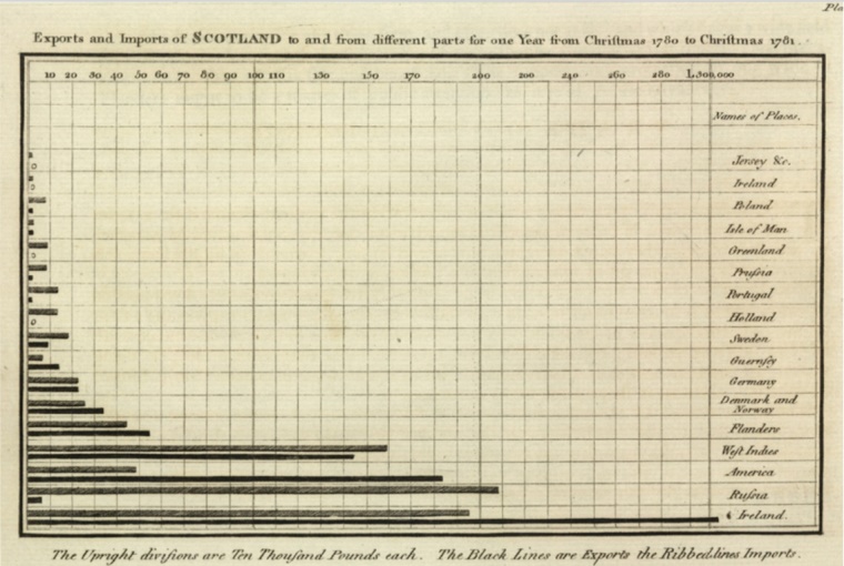
One of the paths (for the compiled bar chart) discussed in a previous post was the Marimekko chart. Today it's time for another type of visualization: a derivative of a bar chart - the bullet graph. Let's start from the beginning. The author of the classic bar chart in the form we know it to this day was already mentioned on the pages of this blog: William Playfair, who posted it in his work "Commercial and Political Atlas" in 1786.

If we believe the stories, he was inspired by Joseph Priestley's work from 1765 and.... lack of data. Joseph Priestley, about 20 years earlier, used the bars on a graph of the lifespan of Greek philosophers (the bars stretched between the year of birth and death). Playfair wanted to prepare a similar chart with information about trading in Scotland. Unfortunately (although for descendants perhaps also "fortunately"), he had data for only one year - hence the resignation from the timeline.
But what if we are faced with not a lack of information, but an excess of information that needs to be presented in a limited space? This question, in the context of a bar chart, was also asked by Stephan Few. As a solution, he proposed a dashboard in the form of a bullet graph.
What is a dashboard? It can be defined as a visual presentation of the most important information needed to achieve a set goal(s). Characteristically, it is placed on a single screen, allowing you to monitor information at a glance.[1]
What is a bullet graph?
It looks like this:

It consists of 5 basic components:
- Label - this part of the graph is responsible for describing what is measured (shown on the bar);
- The intervals along the quantitative scale, which show the qualitative division of the variable value (optional) - the intervals are usually from 2 to 5, are marked with colors and represent the assumed thresholds of good/bad/required values within the analyzed variable;
- The bar with the value of the main measurement - a visual representation of the value of the main variable;
- Quantitative scale on a line axis - looks and functions the same as a quantitative scale on a two-dimensional graph with XY axes;
- Comparative measures (one or two - optional) - referring to the main measure (on the bar), visually less dominant.[2]
That's all for theory. What can we use such a chart for? To compare sales in time, to show the change, the percentage of plan implementation, etc.
Since winter is almost upon us, the heating season has already started, and I am writing from a beautiful, however smoke-covered Krakow, let us see how the graph bullet works in air quality monitoring, more precisely the concentration of pm10 dust in the air. We have data showing the average 24-hour pm10 concentration measured at one of the measurement stations in Kraków (Bujaka Street) during the Christmas and New Year's Eve period in 2016.[3]
Pm10 is a mixture of particles (including toxic particles) with a diameter of less than 10 micrometers, mainly benzenes and heavy metals. In Poland, the standards for pm10 dust are
set at 3 levels:
- acceptable limit value 50 µg/m3 (daily) - air quality is not good but does not cause serious harm to human health
- information level 200 µg/m3 (daily) - this is bad and there is a need to reduce atmospheric activity
- alarm level 300 µg/m3 (daily) - it is very bad, the standard is exceeded six times and it is absolutely necessary to limit the time spent outdoors, and it is best to stay at home.[4]
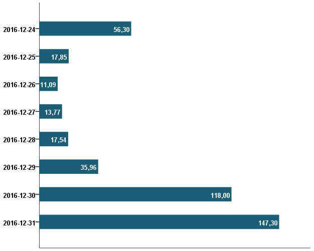
Let's go back to the data. You can show them on a normal bar chart as below.

Each bar represents the average value of a 24-hour measurement on one day. Values are shown in µg/m3. Definitely the highest concentrations, significantly different from other concentrations, are those from 31 December and 30 December (fireworks perhaps?). Well, so what? Do these values exceed the permissible standards? At what level? We will not get this information from this chart.
Let's keep trying. We can create a variable, in percentage, showing the ratio of concentration to the selected standard (in this case the acceptable level):

In the holiday season 2016 in Krakow, according to measurements from the station at Bujaka Street, the permissible standard was exceeded 3 times: on 24, 30 (more than twice) and 31 December (almost three times). We have more information, but now we are not showing the original values of the concentrations. We are also omitting the other exceeded thresholds.
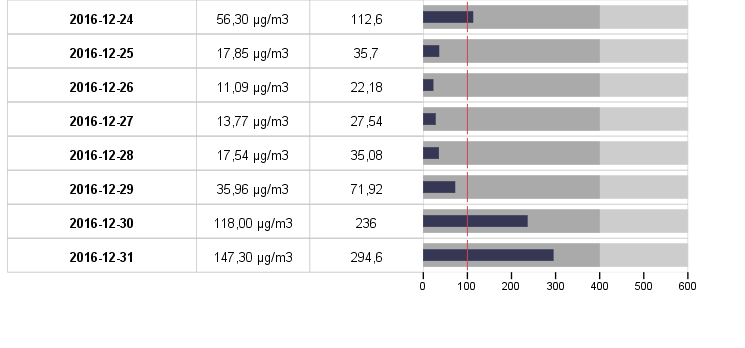
Time for the bullet graph. This time, on one chart we show all the relevant information.

The label is made up of daily dates. In addition, in tabular form, the original values of the average daily dust concentration pm10 and the percentage ratio to the acceptability standard appear. The graph shows the percentage value as a navy blue bar. The red marker is the acceptability standard (as a reference point, hence 100%). The background colors are the information level (4 times the acceptability standard) and the alarm level (6 times the acceptability standard).
Szkolenia
Wykres tabelowy nakładany to procedura dostępna w PS IMAGO PRO. Osoby zainteresowane technikami analizy i wizualizacji danych zapraszamy na szkolenie
[2] Data source: www.powietrze.gios.gov.pl/pjp/archives