We can use frequency tables, but a good way to quickly look at the data is also to present them on charts. To do this, we can use e.g. a histogram or a box plot. The latter one, despite its simplicity, presents a lot of important information, which is often referred to as the five Tukey numbers, which describe the data set. It is the minimum, the maximum, the lower and the top quartile and the median.
Another chart which also contains a lot of information regarding the variable of interest to an analyst is the violin plot.
Zapraszamy na szkolenie ST 2a. Wizualizacja informacji z użyciem raportów tabelarycznych i wykresów
A violin plot can be considered as one of the variants of a box plot, with the difference being that a violin plot presents more data, e.g. we can quickly observe whether the distribution of the presented variables is multimodal.
At the beginning let's see how a simple violin plot looks like for one quantitative variable being height specified in centimeters.
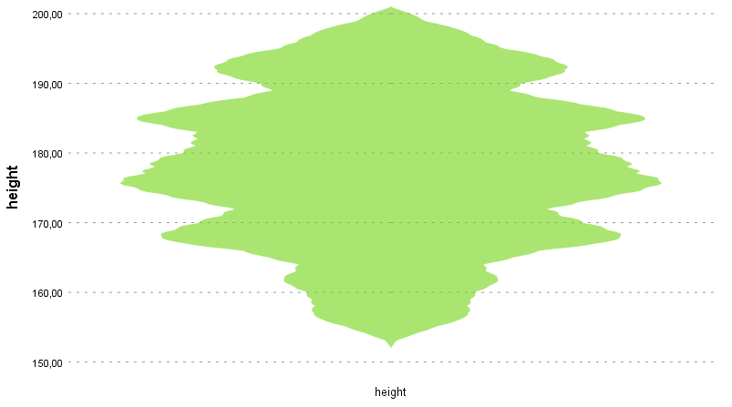
As we can see, the basic form of the violin chart is based on a symmetrical density plot, shown relative to the vertical axis. The visualization shows the distribution for the entire variable, and we can see at a glance which values occur most often and how the distribution of the variable looks overall. Now let's add additional elements to the graph and see what they mean.

The same data are presented on the chart as on the chart above, but with breakdown into sex.
The chart allows presentation of distribution of a quantitative variable within a qualitative variable category. As one can see, a violin plot has several elements in common with a box plot. Additional statistics can be displayed on the plot, i.e. the median position marker and the quartile range.
The chart allows presentation of distribution of a quantitative variable within a qualitative variable category. As one can see, a violin plot has several elements in common with a box plot. Additional statistics can be displayed on the plot, i.e. the median position marker and the quartile range.