This article presents the method of brand image analysis based on market research findings. I will try to answer the question of how to in practice go from the results of market research to making a decision about repositioning the brand, about the choice of marketing messages, or other elements of brand image management. We will follow this process based on a hypothetical beer producer.
Brand positioning using 4 beers as an example
Our beer producer owns four brands: Mercury, Saturn, Luna and Virtus. Their names were inspired by the mythology of the ancient Romans and each of these brands has its own history, target group, opportunities and threats. Here is how a representative of the company’s board describes the current portfolio:
Mercury is our main and oldest brand. It is with this brand that we are most often associated. According to marketing research, consumers of Mercury beer include people aged 25-50 with average incomes. The brand is popular and our goal is to maintain this state of affairs. To this end, we must constantly monitor its image because new brands emerge that may push Mercury to the margins.

In addition to Mercury, we offer three other brands. Two of them, Virtus and Saturn, we launched a few years ago to meet the needs of those customers who consumed Mercury beer less often. Virtus is a cheaper brand targeted at people aged 18-30 with medium and low incomes. Saturn beer, in turn, was designed as a brand for connoisseurs and beer lovers who are able to pay more for high quality. The assumed target group are people aged 35-55 with high incomes. Recently, we have recorded a decline in the sale of this brand and we wonder if this is caused by deterioration of the brand's image.
As for the Virtus brand, it is constantly struggling with a lot of competition from the many cheaper beers on the market, and consumers are sensitive to price changes. We would like the people who drink Virtus beer to become emotionally attached to this brand, and that is why we are working on a brand campaign to distinguish this beer from the competition.
The last and the youngest brand in our offer is Luna. Its introduction to the market was a response to the increasing share of women among beer consumers. In the marketing campaign we emphasised the “femininity” of this beer, and the packaging was designed with great care for aesthetics. We would like to validate to what extent we have created the right image for the Luna brand.
It is worth adding that our main competitor is the producer of the following brands: Ben, Vicky and John. We would like to determine the image of these brands in order to assess the position of our brands in relation to the competition.
As we can see, the reasons for examining brand image can be different: monitoring of the current situation that may warrant a response in the event of an unwanted change; the need to determine the appropriate content in marketing communications; evaluation of marketing campaigns; the need for brand repositioning;- and so-on.

Figure 1: Questions asked to respondents
Taking into account the information needs of the beer producer, we can formulate the following research questions:
- What attributes are assigned to particular brands?
- What associations does a consumer have with each of the brands?
- Which brands have a similar image among consumers? How are individual brands perceived relative to each other?
In order to answer these questions a study was designed in which each respondent was asked to evaluate seven brands based on what characterises them best. The study included the Mercury, Saturn, Luna and Virtus brands as well as competitive brands, Ben, Vicky and John. Respondents answered the following question:
After conducting the research and obtaining the respondents' answers, the analyst faces a question about how the results should be presented. This article will present three alternative ways to analyse and visualise such data. The method chosen should allow us to quickly become familiar with the results and, at the same time, should not take too much space in the report.
How to present the results of the analyses?
One way to analyse brand image data is to create a table.

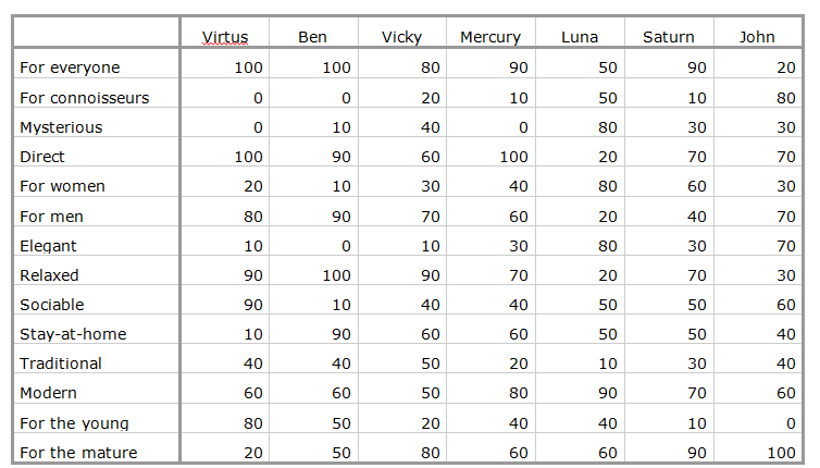
Table 1. A table showing the number of people who attributed particular characteristics to particular brands
Values in the table represent the number of people who assigned a given characteristic to a particular brand. We can read the table by row or by column depending on the question at any given time of the response. When reading the table by column we can find out what features respondents most often attribute to the analysed brand. What is the Saturn brand according to consumers? It appears to be for everyone (not demanding), and for mature people (not for young people). This way we can designate the profile of each of the rated brands. When we read the table by column we can answer the question about which brands stand out the most in terms of one chosen characteristic. Which brands are perceived as elegant? Above all - Luna with John in second place.
Looking at the table it would be difficult to say which brands are similar in terms of all characteristics taken together. Another downside of the table is the fact that in the long run, looking at the columns of numbers can be tiring and time-consuming especially if we analyse more than one table a day. For example, what would happen if we were to evaluate separately the assessments of respondents belonging to various consumer segments? And, what would happen if there were many more brands than in the above example? At some point, the table ceases to be a convenient form to present data. Therefore, it seems a good idea to present them graphically, for example, in a bar chart.

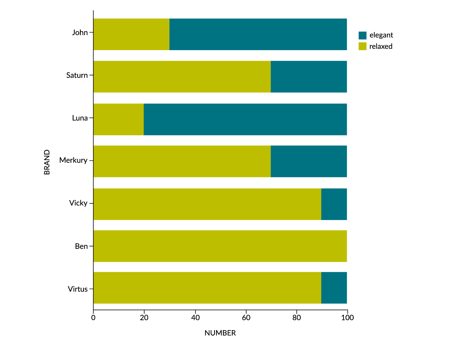
Figure 2: Graph showing the number of people who attributed characteristics to each brand: "elegant" and "relaxed".
This chart allows us to easily compare brands to each other in terms of a pair of characteristics. Its advantage is that we can quickly know the results, for example, it is easy to see that Luna is the most elegant brand, and Ben the most relaxed. Unfortunately, in order to receive full information (about all characteristics and not just one pair), we would have to make seven charts. The analysis of many similar charts can almost be as tedious as analysing many tables. Is it possible to present all the obtained data in one visualization? Introducing the perceptual map.

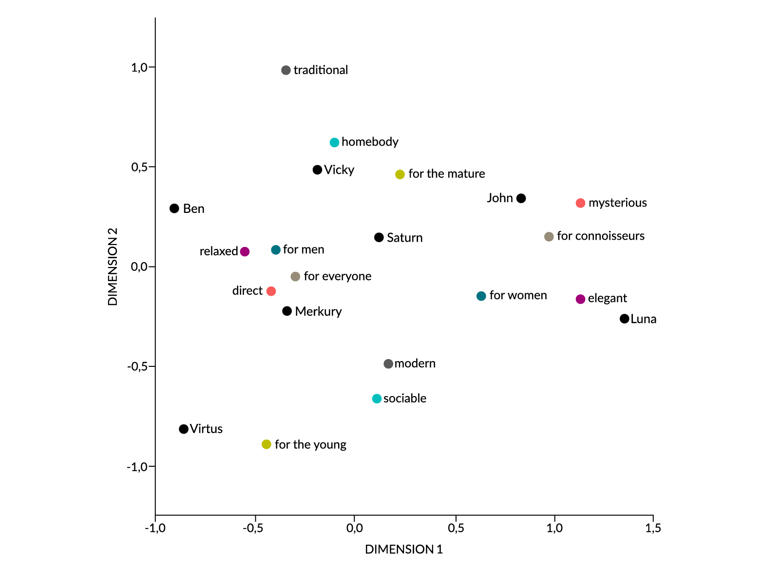
Figure 3: Perceptual map made using multivariate correspondence analysis
The perceptual map presented in this article was created using the multidimensional correspondence analysis procedure. The map allows us to quickly find out which brands are similar to each other and which differ significantly (taking all the characteristics into account). For example, John is similar to Luna, but it is not similar to Virtus. In addition, it allows us to find out which features best characterise individual brands. The mutual closeness of the points show the similarity of particular categories, and the greater distance indicates the lack of similarity. Dimensions represented by the x and y axes are also important, however, the interpretation of this requires a separate analytical process that will not be discussed in this article. For the sake of understanding our example, it is enough to know that the more a given brand is shifted to the right (the higher is the first dimension), the more it is characterised by elegance and mystery; it is a brand for demanding consumers and rather for women (such features are seen in particular with Luna and John). On the left-hand side of the chart, we see a brand grouping that can be called direct, relaxed, for everyone and rather for men. This includes in particular Ben and Virtus. It is also important which brands and which characteristics are at the top and which are at the bottom of the chart: Brands that are located higher are perceived more as traditional, for thestay-at-home and more mature consumer (in our example, Vicky, Ben, John and Saturn). The lower the brand is located, the more it is a brand for the young, modern and sociable consumer (Virtus, but also Luna and Mercury, are characterised by such features).
What does it mean for our beer producer? Is it possible to formulate accurate recommendations based on this perceptual map?
Brand positioning and repositioning after analysis
Let's start with the Virtus brand. As we know, it is a low-price beer. The producer's main goal is to make the image of this brand different from the image of other cheap beers. The immediate competitor to Virtus is Ben, which is also a low-price beer. In some ways, Virtus is very similar to Ben, but the map also shows us areas where these two differ. When building an advertising message, the company should pay special attention to the youth and sociability of the brand, because these are the features that Ben does not possess. Virtus, despite its low price, is a beer that is drunk with friends rather than at home. This can be a great asset that could give its overall image an advantage over its competitors.
In the case of the Luna brand, the producer's main goal was to assess the effects of the image campaign. As we can see, the image of the brand is consistent with what has been assumed. They managed to build the image of a feminine, elegant and mysterious brand. The image of this brand is distinctive - it differs from the others.
The image of the Saturn brand is problematic. This brand, according to the producer's assumptions, was to be perceived as a premium brand. Unfortunately, its image is not unique nor is it coherent. Perhaps the decline in the sale of this beer is a result of a gap between how the producer and how the consumer thinks about this brand. In this case, it would be worth considering brand repositioning.
As we can see, a single perceptual map can tell us a lot. Moreover, it meets the criteria of good visualisation. With a little practice, one glance at the perceptual map gives the analyst a complete picture of the situation. And it takes up a lot less space than multiple charts and tables!