This is why it is worth spending a few minutes with a classic approach to tree visualisation in a slightly refurbished version: the hierarchical graph. The improvements are not only in aesthetics: Their primary task is to help understand and interpret the tree depending on what you are looking for.
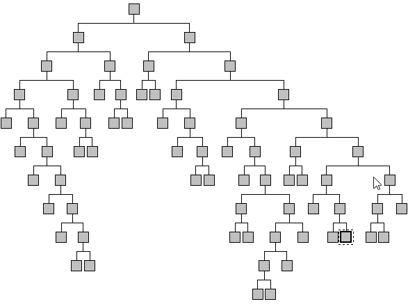
Take a look at the schematic decision tree below which summarises nuts and dry fruit purchasing in a chain of grocery stores. The predicted variable was the purchase of the products, coded 0 or 1 where ‘1’ means ‘purchase’. The target was the ‘purchase’ category.

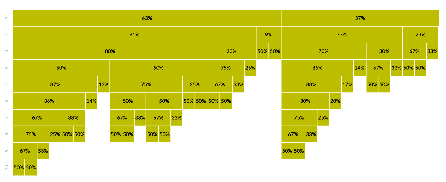
With this tree we are able to see the number of levels, nodes (segments), and paths (branches), however, all segments are presented the same way: as squares of the same size. The question is, how large are individual segments, meaning how many customers meet the requirements of a particular segment? Have a look at the hierarchical graph below.

If such a large, ten-level tree was presented as a treemap, it would be impossible to analyse individual branches. In comparison to the classic tree, the graph above has the same form, namely, each of the ten levels is presented separately in ten rows. The difference is in the size of individual nodes which correspond to the number of observations. In our case, this means that the size of each rectangle is proportional to the number of shoppers it represents. As the size of the segments decrease with each level, the graph resembles icicles. The percentage values represent the share of the nested node of the level above (the superior node) where the denominator is the size of the superior node and the numerator is the size of the investigated node. This allows for a quick assessment of the size of each segment.
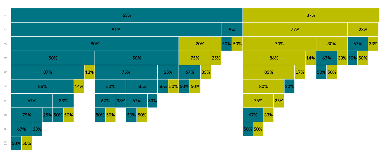
Can we use this graph to determine which segments predict ‘product purchase’? The answer lies below.

The hierarchical graph above represents the same decision tree but with certain elements emphasized using colour coding. Green means the predicted category for the segment is ‘purchase’ and aqua is ‘no purchase’. This way, we can trace every branch of the tree from the initial level to terminal nodes.
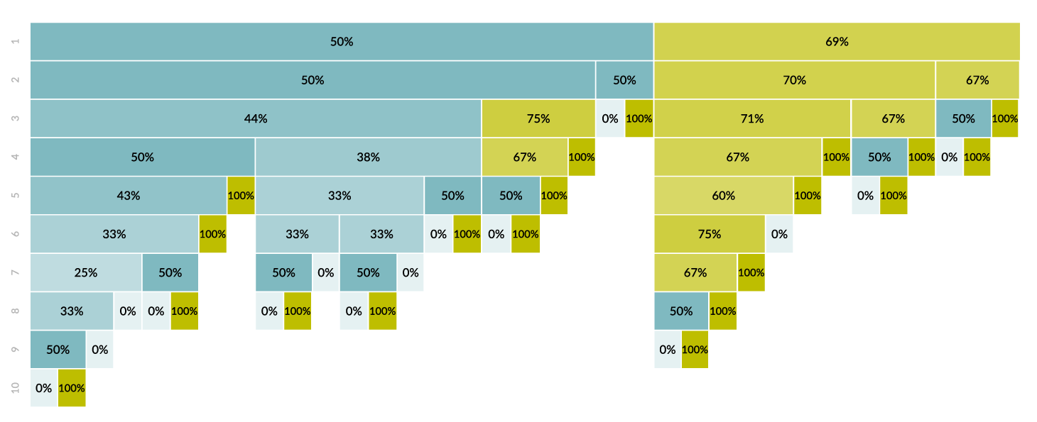
There is one more consideration: we know the size of each segment and the category they predict but how homogeneous are they? What is the share of the predicted category (‘purchase’) in each node? Colour saturation will help here.
. 
In the hierarchical graph above, green represents the prediction of ‘purchase’ and the colour intensity the share of the predicted category in each segment. The greater the colour intensity, the larger the number of 1’s (predicted category ‘purchase’) in the segment. The percentage values shown are related to this measure, where the denominator is the size of the segment and the numerator, the number of 1’s.
This non-standard approach to presenting decision trees as a hierarchical graph has more possibilities than shown above. The key is always the aspect of analysis you want the recipient to focus on.