Did you know that in 2021, the famous pie chart celebrated its 220th birthday?
Its first known, and most important purposeful use, was to visualize the proportion of the Ottoman Empire's geographic distribution across three continents: Asia, Europe and Africa. Such a pie chart first appeared in a book by William Playfair entitled Statistical Breviary and published in 1801 (diagram from Wikipedia).

The pie chart gave rise to a whole range of visualizations created on polar coordinates. And still - despite its old age and widespread use – it is the source of much debate between its supporters and staunch opponents.
What is a pie chart?
Behind a pie chart is a simple concept – to show the relationship of the parts to the whole. The pie chart is divided into slices, the size of which corresponds to the share of a category. The whole, naturally, adds up to 360°.
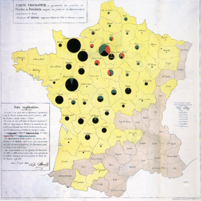
When it first appeared, it strongly appealed to the public's imagination, so it is not surprising that it quickly found imitators. Very possibly taking these features into account, pie charts were placed on a map by Charles Joseph Minard in his visualization from 1858 (the same Charles Minard who visualized Napoleon's march on Moscow, and created a map of French wine exports). Minard thus depicted the amount of cattle shipped from different regions of France to Paris (graph from Wikipedia). In addition to the type of cattle shown within each pie chart, there is an additional element: the size of each diagram is proportional to the number of animals shipped from the region.
Four rules for a correct pie chart
Unfortunately, the strength of the pie chart - the ease of relating the parts to the whole which worked well for both W. Playfair and Ch.J. Minard - works in very few cases. A pie chart will be clear and easy to interpret if:
- the “slices” of the pie chart are few (by “few” we mean 3 rather than 8);
- the values of the slices are close to 0% or 100% (there are large, easily discernible differences between them);
- the values of the slices are close to quarters and halves (i.e., their size is easy to refer to in reality);
- the arrangement of the slices is easy to read (e.g., the beginning of each clockwise hours: 12, 3, 6, 9);
In different situations, the strength of the pie chart becomes its weakness, as the human eye cannot cope with the visual interpretation of acute and obtuse angles.
It can also be problematic to compare slices of the graph if they are not significantly different from each other, and to compare data from across different pie charts.
Does this mean that a pie chart should not be on our menu? It is difficult to have an iron rule here. It simply should not be overused so that it does not lead to indigestion!
Use example
The pie chart below shows the costs of organizing a birthday party. The meticulous organizer decided to summarize the expenses incurred using a ring chart.
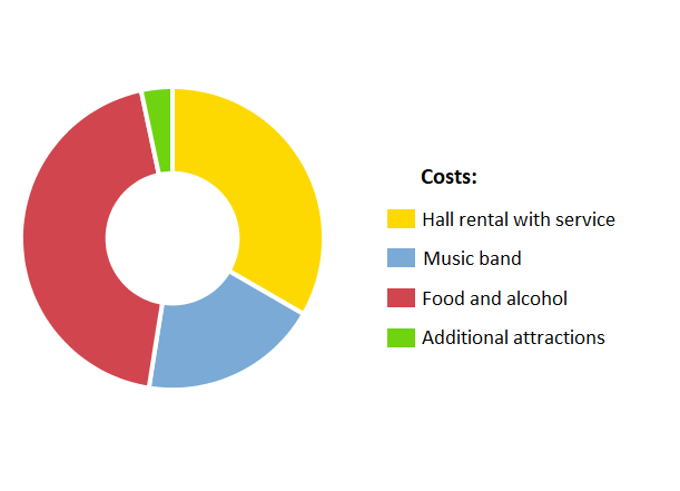
Such a chart is a good start to understanding the data, and the ring chart is an interesting alternative to the standard pie chart. This is one of a number of visualizations included in the analysis engine of PS IMAGO PRO.
Even without presenting the percentages, we can easily see that food and alcohol accounted for the largest share of the cost of hosting the event, followed by hall rental (with staff). At the same time, the cost of renting the hall and the music band consumed more than half of the budget. This gives a certain picture of the total.
If we would like to include more precise statistics (usually a percentage of the total or the number of a particular category) in the pie chart, it is enough to add cutout labels to the diagram.
When is a pie chart the best way to present data?
A pie chart is most effective when you want to present how the individual parts make up the whole. It is especially useful when the number of categories is small and we want to show their proportion to the total. A larger number of slices can lead to a crowded chart and make it difficult to interpret.
When the goal is a quick and intuitive comparison of several categories, a pie chart can be very helpful. It will certainly help attract the viewer's eye and present the most important information in an easy-to-understand way. However, it is more often used in business reports or presentations than, for example, in scientific research, which requires visualizations to be far more accurate.
In conclusion, we should not replace other types of visualizations with a pie chart. Nor should we expect a pie chart to effectively communicate every piece of information. Just as we don't expect to be full after an appetizer, a pie chart should give the viewer an appetite for more!