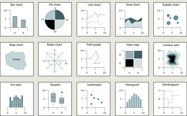
The choice of the chart is often a result of inside-the-box thinking suggested by templates offered by computer programmes. Consequently, having in mind the information to be presented, we tend to consider bar, pie, line, radar charts, etc. This approach is convenient but imposes a rather narrow framework and a number of limitations.

Figure 1. Examples of chart templates.
These restrictions were not an issue when visualisation was all about a sheet of paper. It took time to draw a chart, but it gave the opportunity to ponder over the composition of the chart that would take into account the context of the presented information. There are many examples of such interesting visualisations. A classic instance of such mastery is the chart by Charles J. Minard that represents the march of Napoleon's troops on Moscow.
This chart cannot be confined in the schematic thinking of line vs. pie chart. It is a non-standard visualisation of a story. Such a scheme can be used with different data to represent for example the march of Hannibal or export of French wine (both examples refer to works by Charles J. Minard).
Is it possible, in the computer era, to return to thinking limited solely by the ‘Cartesian space’? Yes, if you have a tool that offers a different approach to visualisation. It can be, for example, the GPL language created by a renowned statistician, Leland Wilkinson. In his book, The Grammar of Graphics he describes a structure of a language that proposes a different approach to visualisation, meaning visualisation design.
The rule of the thumb of the approach is to think about visualisation and build it from basic components. First, consider how many dimensions of the Cartesian system you need.

Figure 3. The number of dimensions necessary to visualise information.
What coordinates to use in the system.

Figure 4. Coordinates used to present data.
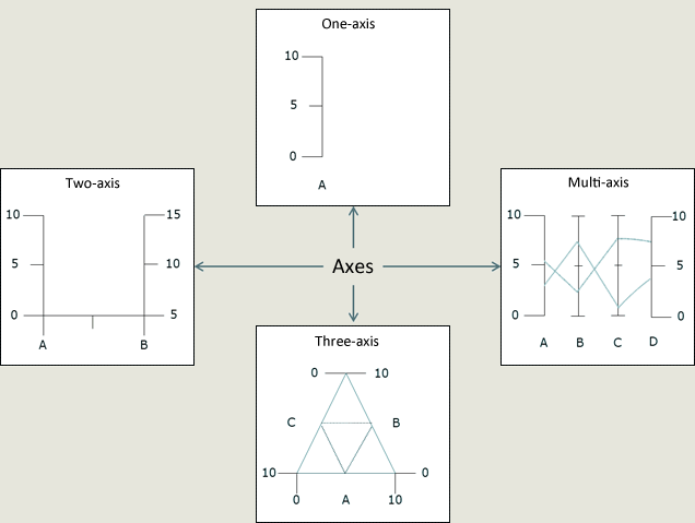
Determine how many axes you need depending mainly on the number of variables to be presented.

Figure 5. The number of axes necessary to visualise data.
Now, decide what elements to present the data with.

Figure 6. Elements representing the data.
We actually use three basic elements to visualise data, a bar is simply a vector made thicker ;)

Figure 7. Three basic forms of data presentation.
This approach to chart building helps design any standard visualisation template for own use or to be shared with others.

Figure 8. Standard visualisation templates
It may also be used to create a template to be used for such visualisations as Charles J. Minard's map of Napoleon's march on Moscow.

Figure 9. Napoleon's march on Moscow
A GPL template by Piotr Szwabowski (well done!)
