This type of plot is useful for determining the relation between two quantitative variables, an important technique in analyzing the correlation, regression, or classification of data.
What is the scatter plot’s main advantage? A scatter plot not only can present the direction of a correlation and its strength, but can also be helpful in indicating clusters of observations with similar values, in verifying the correctness of classifying cases into designated groups, and in the initial determination of whether or not there are observations which deviate from the general trend.
First application of the scatter plot
The scatter plot was first presented in 1833 by English scientist John Frederick W. Herschel, who used it to study the orbits of double stars, and, more precisely, to plot the angle of the position of a double star in relation to the year of the measurement. A scatter plot was used to understand the fundamental relationship between two measurements.
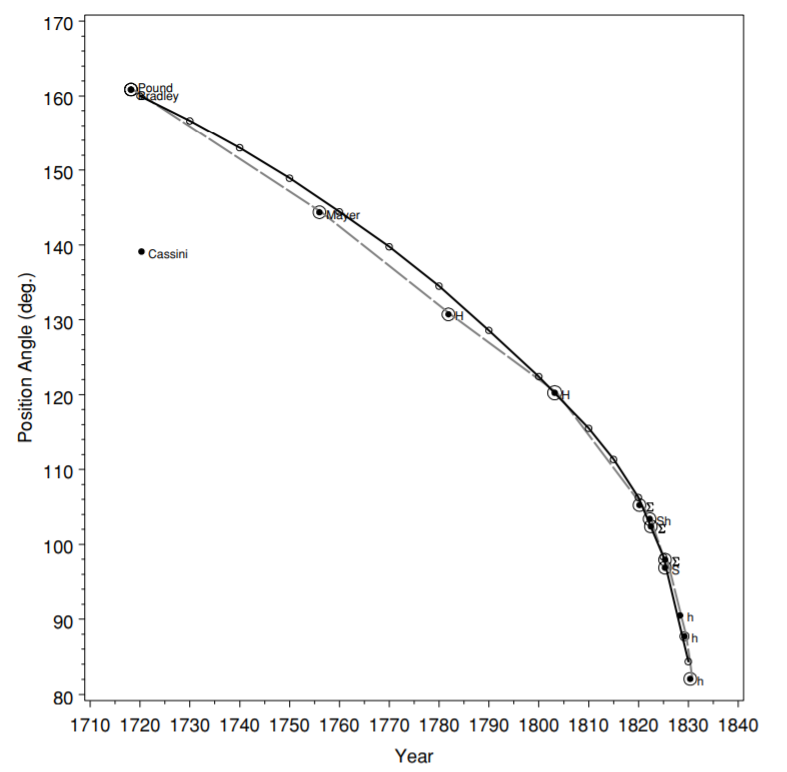
Plot 1. One of the first scatter plots prepared by John Frederick W. Herschel which presents the angle of the position of a double star,
and the year of the measurement. Source: Friendly M., Denis D., 2005: The early origins and development of the scatterplot.
Journal of the History of the Behavioral Sciences, Vol. 41(2), p 118.
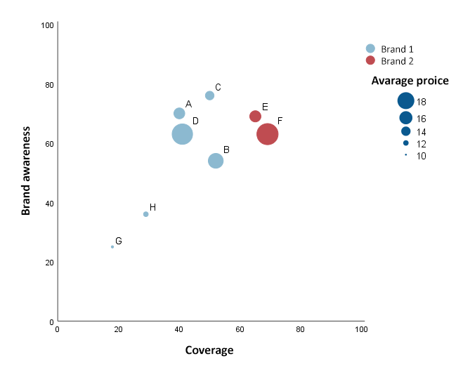
Plot 2. An example of a multi-dimensional scatter plot
How to interpret a scatter plot
The table presents the data on the height and weight for 8 people. Then, the data were presented on a scatter plot (plot 2)
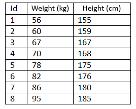
Table 1. Height, and weight of the individuals studied

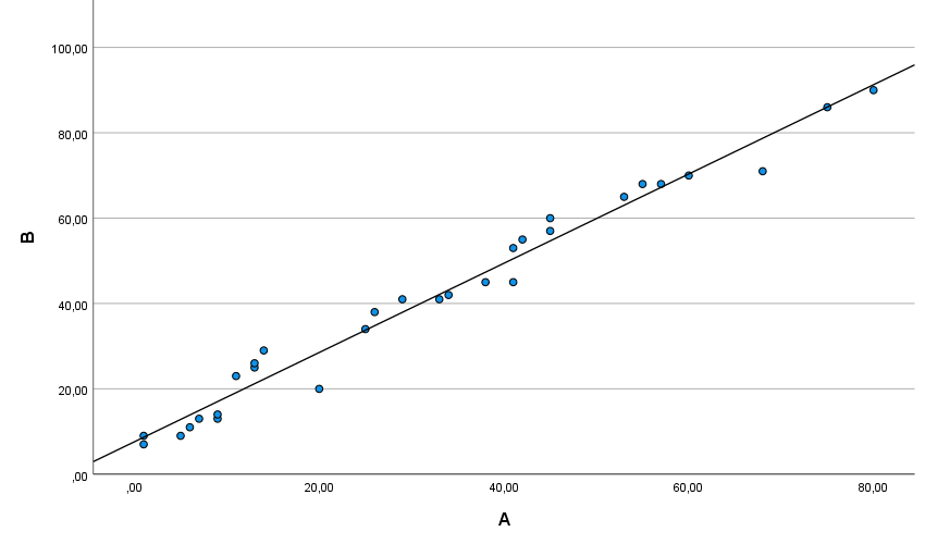
Plot 3. A scatter plot which presents the relationship between the height and weight variables
The points on the plot correspond to the particular cases being analyzed. The data are displayed as a set of points, each of which has the value of one variable specifying the position on the x axis and the value of the other variable specifying the position on the y axis. The y axis presents the data for weight, and the x axis those for height. Person no.1 is associated with point 155 on the height axis, and 56 on the weight axis, person no.2 is associated with point 159 on the height axis and 60 on the weight axis, etc.
When presenting data on a scatter plot, it should be remembered that it is good to plot the dependent variable on the y axis, and the independent variable on the x axis.
Relationship direction and correlation
The arrangement of the points presenting the value of the two variables on a scatter plot may tell an analyst a lot about the relationship between the variables being analyzed. The relationship between the two variables can be described using a linear, quadratic, logarithmic, exponential function, and others.
Let's take a closer look at the linear correlation. A scatter plot can represent the correlation between two variables; it may be positively linear (positive correlation), negatively linear (negative correlation), or null (no linear correlation, independent variables). If the points on the plot are arranged from the left bottom corner to the right upper corner, this indicates a positive correlation between the variables being analyzed (plot 4). Oftentimes, in order to determine the relationship direction for two variables, it is helpful to add match lines to the scatter plot.
Plot 4. Positive correlation between variables
If the arrangement of the points on the plot runs from the left upper corner to the right bottom one, this indicates a negative correlation (plot 5).
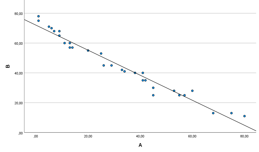
Plot 5. Negative correlation between variables
The plot, where the points are scattered in the form of a cloud, will usually indicate the absence of a linear relation between the variables being analyzed (plot 6).
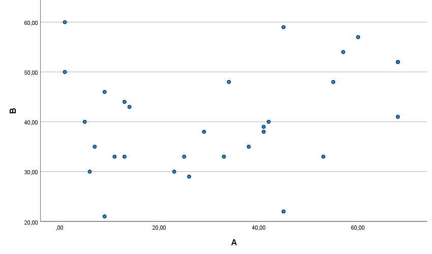
Plot 6. Independent Variables
To sum up, presenting data by means of a scatter plot makes it possible to:
- present and understand the relations between two quantitative variables,
- show unusual values,
- identify data clusters,
- add a line together with a match function, and use it to forecast new data values.
It is worth adding that, on a scatter plot, additional qualitative, or quantitative variables may be used, which will expand the range of the data being presented.