The treemap is a relatively new form of visualisation invented in the 1990s. It was designed by Ben Shneiderman, a lecturer at the University of Maryland (https://www.cs.umd.edu/users/ben/). He wanted to create a visualisation that shows nested hierarchical data in two dimensions and at the same time achieve the following:
- solve the issue of space limitation (adequate occupation of a two-dimensional space);
- solve the issue of limited disk storage space ( limit data download when generating the visualisation);
- assign meaning to colours (and their intensity) and the size of elements;
- be intuitive to the user.
How does the treemap meet these criteria? The illustration below shows the dependencies between the hierarchical tree and the treemap (in its basic form).
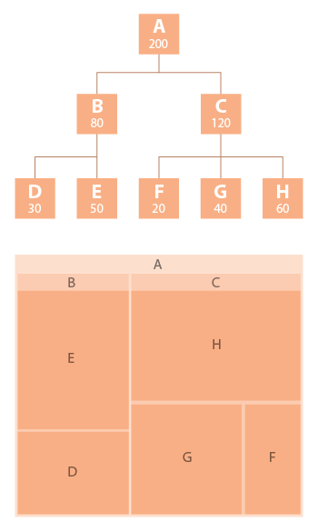
source: https://datavizcatalogue.com/methods/treemap.html
The first, or primary node of the tree (parent), A, is 200 observations or the whole ‘cake’. It takes up all the designated space in the corresponding treemap (the brightest colour). The first subdivision in the tree (children nodes) are nodes B (80 observations) and C (120 observations). These two nodes are represented in the treemap in a darker shade and fill up the space in accordance with their size. The last tier with nodes D through H demonstrate nesting of not only the first subdivision (nodes E and D in node B, and nodes F, G, and H in node C) but also the division of the whole available space (A) in accordance with the size of each node.
Let's move on to the next example. The treemap below shows the share of sales of cosmetic products in stores classified as large, medium and small, in the Lesser Poland region in 2017. The cosmetics were divided into 8 categories resulting intwo levels: the type of store and cosmetic product and also sales value. The surface area of individual elements will be determined not by the size in individual categories but by the sales values. The statistics are presented in such a way as not to focus too much on the meaning of colours and sizes of individual rectangles, features that are key for the treemap.
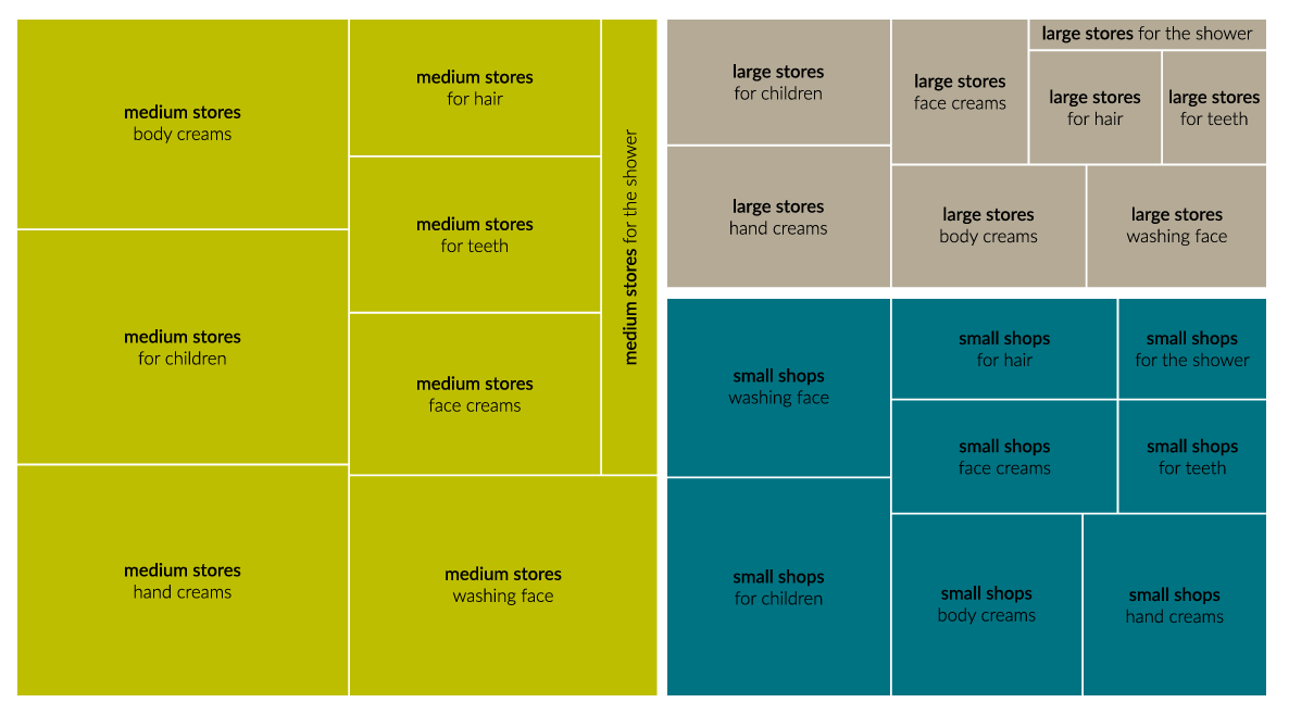
The treemap tells us that medium stores achieved the best sales in 2017. They are dark green and take up the largest surface area. Within this category, the largest share in sales was hand cosmetics. At the same time, we can see that cosmetic products for children in medium stores took the largest share in cosmetics sales in 2017 because the data is nested and we divide a single space.
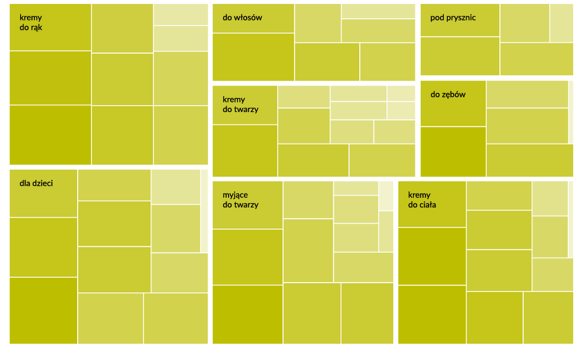
Going a step further, the treemap below shows the same sales data but the first division is for the type of cosmetic product (8 categories as in the map above) and the next one focuses on the manufacturer (a different number of categories is used here). We also have an additional dimension as we used the intensity of the colour relative to the share of pharmacies in the sales. The more intensive the colour, the larger the share of pharmacies in the category (which is not necessarily related to the amount of sales, which is the size of the rectangle). There is one rectangle in hair cosmetics that has a particularly intensive colour (bottom left corner). These are specialist dandruff products which may explain why they were sold mainly in pharmacies.
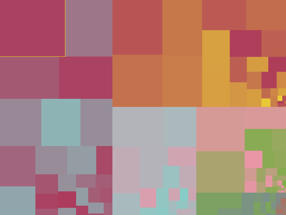
Can data visualisation in the form of a treemap be an artform? According to its author, Ben Shneiderman, it can, particularly when you think of Op-art. For some great examples of this go to https://treemapart.wordpress.com/.