COLUMN AND BAR CHARTS
Column and bar charts are one of the graphical ways of presenting the distribution of a characteristic under study. These types of graphs consist of rectangles placed on the x-axis or y-axis. The rectangles are determined by the analyzed categories of the variable and their height is determined by the number of elements in the category. With the help of this type of graphs it is possible to show graphically the distribution of the studied characteristic or characteristics, which consequently allows us to better understand the variables or phenomenon that we are analyzing.
Column and bar charts are one of the most popular types of data visualization. They can be used, for example, to show the number of respondents by province, the popularity of films shown in cinemas or the number of products sold in a store. Despite the fact that column chart and bar chart are commonly used interchangeably, it is worth distinguishing between them. A column chart is a chart that presents rectangles for data in a vertical orientation, while a bar chart presents data in a horizontal orientation.
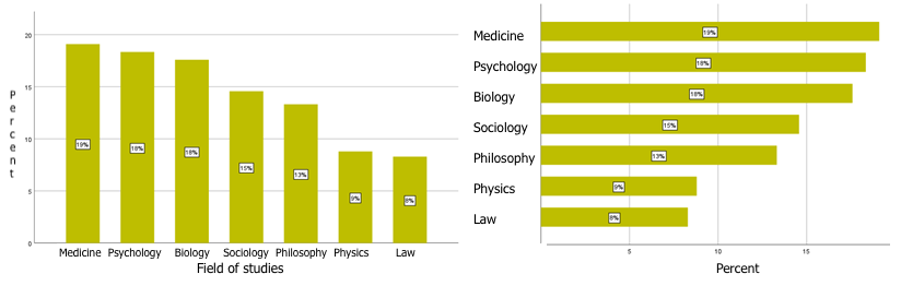
Figure 1: Column chart and bar chart
This type of chart is most often used for qualitative data, i.e. for nominal and ordinal variables, but it is also worth remembering that with this type of chart we can also present data for a quantitative variable and a qualitative variable. Below we present in a bar chart the 10 movies with the highest revenues in 2021 in the US.
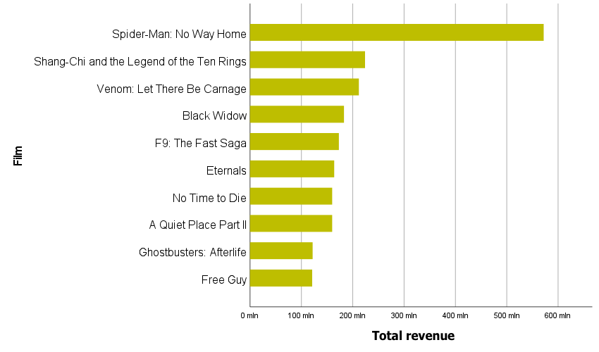
Figure 2: Top 10 films with the highest revenue in the U.S. in 2021. ($ values).
Regardless of whether the bars are placed vertically or horizontally, attention should be paid to the order in which they are arranged. In the case of nominal variables the analyst is usually interested in sorting the categories according to the values presented on the bars, which will allow the viewer to easily find the most and least numerous categories. In the case of ordinal variables, it should be remembered that the individual categories of this variable already have their natural order and in this case we present the data without sorting them.
COLUMN AND BAR CHART - EXAMPLES
Let's take a closer look at column and bar charts. These types of charts are easy to read. By comparing the tops of bars or columns, we can see the largest and smallest values, and it is easy to determine how the difference between categories presents itself.
When the category labels are too long and do not fit under the bars on the x-axis, it is a good idea to replace the column chart with a bar chart. This layout makes it easier to read the data presented.
Chart 3. For long category labels, it is useful to present the data in a bar chart.
Because of how our sight compares relationships between bars or columns, it is worth remembering to start such a graph on the axis at point 0, otherwise it may create a misleading message for the viewer. In the two graphs below, the same data is presented for one company's average payroll over a three-year period. Looking at the chart at the top, it appears that wages are increasing by up to 50% each year. If we look at the scale we can see that it does not start at 0 but at a value of 2900. In addition, labels are not displayed on this chart, which also affects the perception of the data presented.

Figure 4: Scale manipulation can cause a misleading perception of the data presented
GROUPED AND STACKED CHARTS
In case of column and bar charts we have the possibility to present one, two or many series of data. By adding another variable we can prepare grouped and tabulated charts. In a grouped bar chart or column chart, each category of the added variable will contain one bar/column for each category of the main variable.
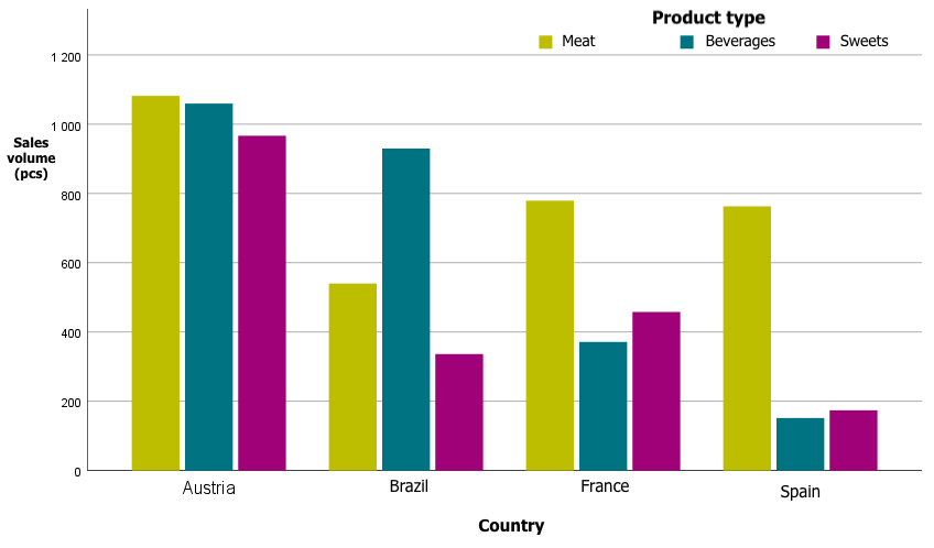
Figure 5: Example grouped column chart (sales volume by product type and country)
For a tabulated bar chart, each statement consists of a bar divided into segments stacked on top of each other. The height of each segment corresponds to its value. Each level of a category variable corresponds to one collated bar.
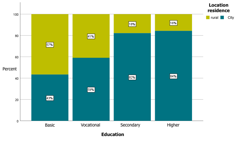
Figure 6.Sample tabulated bar chart (respondents' education vs. place of residence)
When we want to present percentages in summary and grouping charts, we have the option to indicate by which variable the percentages are to be calculated. We can calculate a summary for the total, total for each category of the x-axis variable, or total for each category of the grouping variable.
HISTOGRAM
Now let's discuss what a histogram is and how it differs from a bar chart or a column chart. A histogram is a column graph in which the columns (rectangles) are adjacent to each other and whose height indicates the abundance of the characteristic under study, while at the base of the graph (x-axis) the class intervals of the variable are shown. Histogram is a graph that can be used to present quantitative data, such as age, income, height or weight. Note that every histogram is a column graph, but not every column graph is a histogram. A histogram is often used in the initial stages of working with data when an analyst wants to see what the distribution of a quantitative variable looks like. A histogram will allow you to quickly assess whether a variable has a distribution close to a normal distribution[1], whether the distribution is skewed, unimodal, or perhaps multi-modal, etc.
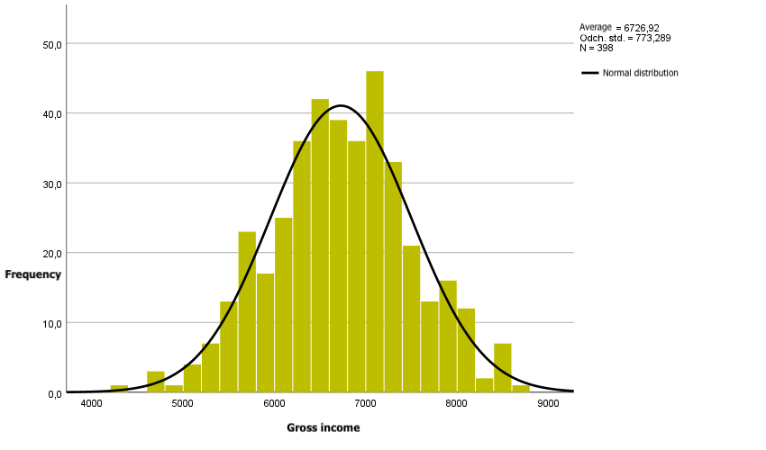
Figure 7: Example histogram with normal curve
In summary, column and bar charts are very popular chart types. Their big advantage is that they are easy to interpret. For data with long category labels, a bar chart may be the solution. Column and bar charts can be used for qualitative variables as well as combinations of qualitative and quantitative variables. For quantitative data, a histogram will work well, not only to show the distribution of the variable but also to compare it to a normal curve.